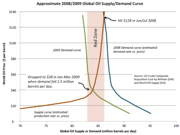
To understand how a small drop in the demand for oil can cause oil prices to plummet, consider the shape of the oil supply curve.
Most oil is produced for less than $30 per barrel out of the ground. However, the last few million barrels produced per day to meet normal demand can be very expensive. So, when oil demand increases beyond the available supply or available supplies are disrupted, market prices increase. On the other hand, when oil demand drops below existing supplies, prices fall.
Take the 2008 supply and demand curve as an example. In June 2008, demand exceeded supply, so the price of oil rose as high as $128 per barrel. When the recession hit, demand dropped by less than 3 percent, but that was enough to shift demand below supply and crash the price of oil to $38 a barrel. That dynamic is likely to happen again as EVs reduce oil demand.
The supply curve for oil looks like a hockey stick with most supply below $30/barrel and then a steep increase (red supply curve).
In July 2008, demand for oil was high so companies invested in expensive sources of supply.
The recession caused demand to drop by only 2.7%. This caused the demand curve (in blue) to shift to the left (olive green curve).
The Red Zone illustrates where a small drop in demand results in a dramatic drop in price.
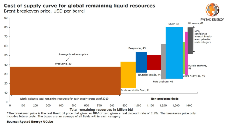
Below is a 2019 supply curve from Rystad Energy showing a similar shape.
Nullam quis risus eget urna mollis ornare vel eu leo. Aenean lacinia bibendum nulla sed
